Flexbox
Flexbox Layout:
This Flexbox layout is easier to design flexible responsive layouts without using float or positioning.
Before flexbox layout, there were other layouts.
- block - element behaves as block element (for sections in a webpage)
- inline - element behaves as inline element(for text)
- position - for explicit position of an element
- floats - to float to left or right
- table- for two-dimensional table data
Rule - To start using the Flexbox model, you need to first define a flex container.
A Flexible Layout must have a parent element with the display property set to flex.
Direct child elements of the flexible container automatically becomes flexible items.
Example:
HTML
    <div class="flex-container">
        <div>1</div>
        <div>2</div>
        <div>3</div>
    </div>
CSS
.flex-container {
  display: flex;
  background-color: lightgreen;
  height: 100px;
  width: 50%;
}

.flex-container > div {
  margin: 10px;
  height: 80px;
  width: 80px;
  padding: 20px;
  background-color: blueviolet;
  font-size: 2rem;
  text-align: center;
}
This will produce the following result −

The flex container properties are:
- flex-direction
- justify-content
- align-items
- flex-wrap
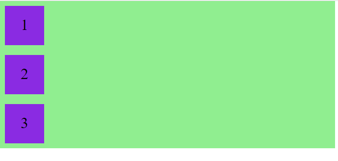
flex-direction property:
- The flex-direction property defines in which direction the container to arrange the flex elements.
- We can arrange flex element is in two directions either row or column.
- By default, flex-direction property is row.
Example:
CSS
.flex-container {
  display: flex;
  flex-direction: column;
  background-color: lightgreen;
  width: 50%;
}
This will produce the following result −

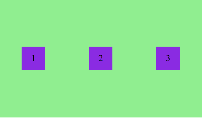
justify-content property:
- This property is used to align flex items in the flex-container to it’s start or end or center and provide space between the flex items.
Example:
CSS
.flex-container {
  display: flex;
  justify-content: center;
  background-color: lightgreen;
  height: 100px;
  width: 50%;
}
This will produce the following result −

CSS
.flex-container {
  display: flex;
  justify-content: space-around;
  background-color: lightgreen;
  height: 100px;
  width: 50%;
}
This will produce the following result −

align-items Property:
- This align-items property works just like justify-content property.
- For example, if flex-direction property value is row then justify-content property works in row direction and align-items property works in opposite direction i.e. column direction. If flex-direction is in column direction then justify-content works in column direction and align-items property works in opposite direction i.e. row direction.
- Just remember this, justify-content property always works in the same direction as flex-direction property and align-items property always works in opposite direction of flex-direction property.
Example:
CSS
.flex-container {
  display: flex;
  justify-content: space-around;
  align-items: center;
  background-color: lightgreen;
  height: 400px;
  width: 50%;
}
This will produce the following result −

flex-wrap:
- The flex-wrap property specifies whether the flex items should wrap or not.
- By default flex-wrap property value is nowrap.
Example:
CSS with nowrap
.flex-container {
  display: flex;
  background-color: lightgreen;
  height: 200px;
  width: 50%;
}
This will produce the following result −

CSS with wrap
.flex-container {
  display: flex;
  flex-wrap: wrap;
  background-color: lightgreen;
  height: 200px;
  width: 50%;
}
This will produce the following result −
