Responsive Media Queries
Responsive Media Queries
What Is Responsive Design? 🤔🧐
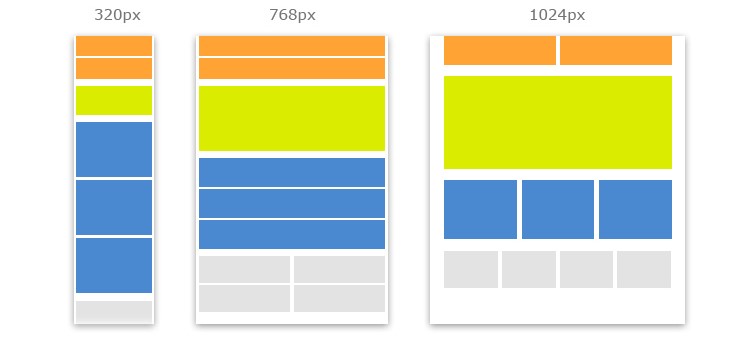
Responsive design is a way of building websites / web app so they automatically conform to the dimensions of whatever device they appear on.
Responsive design and media querying provide solutions for ensuring your website / web app automatically adapts across all devices and screen sizes. The size and position of site elements ‘responds’ to the so-called viewport.
The goal of responsive design is to make accessing sites as comfortable as possible for visitors without the need for zooming, scrolling, and resizing.
They are central and complex topics that, once you grasp the concept of, will make creating responsive sites much easier.
The @media rule is used in media queries to apply different styles for different media types/devices.

Syntax:
/* Set the background color of body to yellow */
body {
  /* your CSS here */
}

/* On screens that are greater than / equal to 768px, set the background color to green */
@media screen and (min-width: 768px) {
  body {
    /* your CSS here */
  }
}

/* On screens that are greater than / equal to 1024px, set the background color to green */
@media screen and (min-width: 1024px) {
  body {
    /* your CSS here */
  }
}
Example:
index.html
<!DOCTYPE html>
<html>
    <head>
        <link rel="stylesheet" href="style.css" >
    </head>

    <body>
        <div class="boxContainer">
            <div class="box">
                Element 1
            </div>
            <div class="box">
                Element 2
            </div>
            <div class="box">
                Element 3
            </div>
            <div class="box">
                Element 4
            </div>
            <div class="box">
                Element 5
            </div>
        </div>
    </body>
</html>
style.css
* {
  margin: 0;
  padding: 0;
  box-sizing: border-box;
}

.box {
  margin: 20px;
  width: 200px;
  height: 100px;
  background: rgb(40, 136, 153);
  color: #ffffff;
  font-size: 20px;
  display: flex;
  justify-content: center;
  align-items: center;
}

@media screen and (min-width: 768px) {
  .boxContainer {
    display: grid;
    grid-template-columns: 350px 350px;
  }
}

@media screen and (min-width: 1024px) {
  .boxContainer {
    display: grid;
    grid-template-columns: 20% 20% 20% 20% 20%;
  }
}
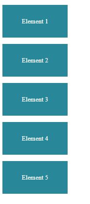
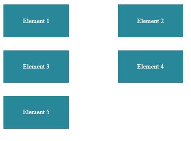
This will produce the following results −
Viewport width upto 767px (Mob Version)👇

Viewport width b/w 768px & 1023px (Tab Version) 👇

Viewport width above 1024px (Tab Version) 👇

Mobile First Approach?
Mobile-first is when we start by writing our CSS for mobile devices and then use media queries to add in styling for larger screen sizes.
In general, that means that media queries use a min-width.
Why Go Mobile First?
- Its easier to first code for mobile version then change some properties & rearrange them in bigger versions
- Mobile traffic is growing… fast!. Mobile only has been on the rise with no expectations to slow down. Considering the trend, desktop viewing may no longer be the norm
- Since people see websites in mobiles a lot, tons of folks have written on the negative effects of poor site design/functionality, particularly in regards to site speed. Bottom line: if your site doesn’t work well on mobile, you’ll lose users
- Some aspects of a website that are designed for the desktop simply cannot be recreated on a mobile screen. So why wouldn’t you design specifically for a mobile screen? Anything that can be viewed on a mobile version can also be viewed on a desktop version. Instead of trying to fix the issues that often accompany trying to scale a large screen experience down to a small screen experience, starting with mobile works within the limitations of the smaller screen from the beginning